The Hidden Work Behind Marketing That Feels Natural, Consistent, and Trustworthy

Recent Posts

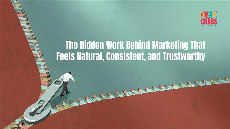
Some brands don’t try very hard to be noticed, yet they stay with you. 

You might not remember the first time you saw them. You may not recall a specific campaign or post. But when they appear again, everything feels familiar. The tone makes sense. The communication feels steady. Nothing feels out of character. 

That ease is not accidental. 

Marketing that feels natural is usually the result of long-term thinking and quiet discipline. It is shaped by decisions that protect brand consistency and guided by a trust based marketing strategy that values credibility over short-lived attention. 

Why marketing that feels easy is rarely easy to build 

When marketing feels effortless, it’s tempting to assume it came together instinctively. In reality, ease is often the outcome of complexity being resolved early. 

Brands that feel natural have already made clear choices about: 

  • How they want to sound 
  • What they are willing to repeat 
  • What they are willing to ignore, even when it’s trending 

This clarity removes friction not just for the team creating the work, but also for the audience consuming it. 

Research by Lucidpress shows that consistent brand presentation can increase revenue by up to 23 percent, largely because familiarity reduces hesitation and builds confidence over time (Lucidpress). 

People don’t trust brands because they are impressive. They trust brands because they feel reliable. 

The work that happens before anything goes live 

Most people see the final output. Very few see the groundwork behind it. 

Much of the real work happens before a post is written or a campaign is launched. It lives in alignment, structure, and long-term intent. Without this foundation, even strong ideas start to feel disconnected over time. 

Behind the scenes, this work often includes: 

  • Defining clear brand principles that guide decisions 
  • Aligning teams so communication feels unified 
  • Planning content as a connected narrative, not isolated moments 

At RedCrabs, this is where a significant part of our focus lies. We work on building clarity early so that execution later feels calm and intentional rather than reactive. When the foundation is strong, creativity doesn’t get restricted. It becomes more focused. 

How trust actually forms over time 

Trust is rarely built through reassurance or polished messaging. It forms through repetition and consistency. 

When a brand shows up the same way across platforms and over time, people begin to rely on it without consciously thinking about why. The experience feels familiar. The intent feels clear. 

According to the Edelman Trust Barometer, 81 percent of consumers say trust influences whether they choose to engage with or buy from a brand (Edelman). 

Trust grows when brands: 

  • Maintain a steady tone across touchpoints 
  • Avoid overreacting to short-term metrics 
  • Stay aligned with their values as they scale 

Small inconsistencies may seem harmless in isolation, but over time they quietly weaken confidence. 

Looking beyond short-term visibility 

Short-term marketing focuses on being seen. 

A long-term brand building strategy focuses on being remembered. 

Instead of asking what will perform today, long-term brand building considers what will still make sense months and years from now. This mindset influences how content is planned, how campaigns connect, and how success is measured. 

Research from Nielsen consistently shows that brands investing in long-term brand building achieve more sustainable growth than those focused only on short-term activation (Nielsen). 

Over time, this approach leads to: 

  • Communication that feels connected rather than scattered 
  • Quicker trust when introducing new offerings 
  • Stronger results from performance-led marketing 

The impact is gradual, but it compounds. 

What consistency really means in practice 

Consistency does not mean repeating the same message endlessly. It means alignment. 

A strong brand can evolve, experiment, and adapt without losing its identity. The tone remains recognisable even as formats change. Decisions feel intentional rather than reactive. 

In practice, consistency shows up as: 

  • A recognisable brand voice across platforms 
  • Visual and verbal coherence over time 
  • content decisions guided by long-term intent 

This level of alignment requires discipline and process, not rigidity. It is an ongoing commitment that supports both clarity and creativity. 

Why the quiet work matters most 

Most audiences never analyse why they trust a brand. They simply feel comfortable returning to it. They hesitate less. They recommend it without needing to explain why. 

That behaviour is shaped by many small, consistent signals delivered over time. Not by one campaign. Not by one viral moment. But by alignment maintained quietly in the background. 

Marketing that feels natural is built deliberately. 

Marketing that feels consistent is maintained carefully. 

Marketing that feels trustworthy is earned patiently. 

For brands looking to strengthen brand consistency without limiting creativity, this foundational work is essential. Our services are designed to support this balance and can be explored at RedCrabs Services. If you’d like to discuss how this approach fits your brand, you can connect with us through Contact Us. 

Packaging design

Key 68

Project

  • Graphic Design
  • Label Packaging
  • Illustration

Industry

Health & Wellness

Platform

Supplement & Product

Url

https://Key68shopifynet/

redcrabs the best digital marketing agency in hyderabad provided Brand Identity & Packaging Design for KEY68

About project

Discover the Hidden World Within: Your Microbiome Matters

Trillions of microscopic allies live within you, supporting your wellness from gut health to overall vitality. This complex ecosystem influences 100+ aspects of your well-being.

Understanding and nurturing our relationship with the microbial world opens doors to enhanced health and a deeper appreciation for life’s intricate web.

Find Right Product For Right Solution

Color Palette

The predominant color will be SunflowerYellow.
It will be used as the main color and
base color in all its combinations.

Other colors that will complement
the brand identity will be 4Skus Respective Colors.

Typography

Ambient (Regular)

Ambient (Regular, Medium, & Bold)

Aa Bb Cb Dd Ee Ff Gg Hh Ii

Jj Kk Ll Mm Nn Oo Pp Qq R

Ss Tt Uu Vv Ww Xx Yy Zz

0 1 2 3 4 5 6 7 8 9

Graphic Design

MedhAnkura

Project

  • Graphic Design
  • Logo Design
  • Branding

Industry

Innovation

Platform

Research & Innovation

Branding

Research & innovation Company

Letter ‘M’

Medha (intelligence or brain)

Ankura (sapling)

004C91

F47421

THE PULSE OF INNOVATION: MEDHANUKRA’S VISION IN COLOR

At MedhAnkura, F47421 symbolizes bold energy, passion, and creativity, driving our relentless pursuit of innovative solutions.

004C91, represents the spark of discovery, illuminating new ideas and guiding MedhAnkura toward transformative solutions.

Graphic design

Ayuvu

Project

  • Graphic Design
  • Logo Design
  • Branding

Industry

Medical

Platform

Monitoring & Innovation

Brand Identity

Ayuvu Command Centre

Healthcare & Connecting Dots

Letter ‘A’

AYUVU Icon

004C91

F47421

AYUVU COMMAND CENTER

Logo Elements:

  •  Healthcare Symbol: The logo uses a bold, modern cross as its central symbol. This is a widely recognized symbol of health and medical care.
  • Square and Lines: The cross is enclosed within a square. The square can represent stability, structure, and order.

Health Care Hub

The logo could represent a central hub for a healthcare network, connecting people to health resources and medical professionals regardless of location.

Global Reach

The Dots extending outwards could signify the organization’s global reach, providing healthcare services to people around the world.

Collaboration

The cross, a symbol of medicine, intertwined with a square, which can represent technology or structure, could embody the concept of health and technology working together.

Colour Scheme

Blue: Blue is associated with trust, security, and professionalism, all of which are important for a healthcare organization.

Orange: Orange Is associated with trust, security, and professionalism, all of which are important for a healthcare organization.

Video design

Ayuvu

Command Centre

Project

  • Video Design
  • Video Editing
  • Visual Communication

Industry

Healthcare

Platform

Visual Communication & Healthcare

Video Design & Editing

Ayuvu Command Centre

Video design

RAMAYYA
Story

Project

  • Video Design
  • Video Editing
  • Visual Communication

Industry

Healthcare

Platform

Visual Communication & Healthcare

Video Design & Editing

Story Narration

ATL/BTL

Smart Rack

Project

  • Video Design
  • Video Editing
  • Visual Communication

Industry

Healthcare

Platform

Pharma &
Inventory management

Video Design & Editing

Smart Rack

ATL/BTL

MedUnited

Hospitals

Project

ATL/ BTL

Industry

Healthcare

Platform

Hospitals & Clinics

ATL/BTL

Hospitals & Clinics

ATL (Above The Line)

WhatsApp Image 2024-11-08 at 20.29.33_3d5d49e3

BTL (Below the Line)

2024 - World Heart Day “Health Walk”(Amalapuram)

Research & Validation

MedUnited
Hospitals

Project

  • Market Research
  • Market Validation
  • Secondary Research
  • Competitor Analysis
  • Business Audits
  • Cluster Research

Industry

Healthcare

Platform

Research & Validation

Research & Validation

MedUnited Hospitals

COMPANY OVERVIEW

At RedCrabs, our Research & Validation team specializes in delivering thorough market insights, competitive analysis, and data-driven strategies. We provide valuable guidance to support our clients’ expansion, market entry, and sustained growth. Our client portfolio includes prominent healthcare(MedUnited, KIMS, AyuvuBharosa), technology, insurance(Trovity) and real estate firms like Avaasa. Below is a detailed breakdown of our work for MedUnited, covering our processes in competitor analysis, market validation, primary and secondary research and market scope identification.

01.

Competitor Analysis

02.

Market Validation

03.

Primary and Secondary Research

04.

Identifying Scope of Expansion

Competitor Analysis

Our work with MedUnited included a thorough Competitor Analysis to identify key players in the healthcare market across the Amalapuram and Raipur clusters. By examining the service portfolios, pricing structures, patient satisfaction levels, and unique value propositions of competitors, we highlighted areas where MedUnited could differentiate its services. The analysis informed MedUnited about

Gaps in competitor offerings

Strengths and weaknesses of local and regional competitors

at RedCrabs we help you identify the Strengths and weaknesses of local and regional competitors

Potential strategies for attracting and retaining patients based on competitor insights

This competitor analysis equipped MedUnited with a clear view of the competitive landscape, highlighting positioning opportunities that would appeal to a diverse patient demographic.

MARKET VALIDATION
To ensure the feasibility of MedUnited’s market expansion, we conducted Market Validation focusing on both secondary and primary data sources to understand demand, healthcare accessibility, and community health needs in Amalapuram and the surrounding areas. Our validation process included:

“Analysis of the demographic and socio-economic profile of the target market.”

“Evaluation of healthcare spending patterns and patient preferences.”

“Assessment of healthcare provider density and demand for specific medical services.”

Through these insights, we confirmed the region’s demand for expanded healthcare services and identified areas where MedUnited could introduce differentiated offerings, making an impact in underserved communities.

PRIMARY AND SECONDARY RESEARCH

Our approach relied on Primary and Secondary Research methods to gather data accurately and comprehensively:

Primary Research

We conducted on-the-ground surveys with patients, doctors, and healthcare administrators across hospitals and clinics in Amalapuram, Raipur, and Palakole clusters. By engaging with local residents and healthcare providers, we obtained firsthand insights into patient satisfaction, treatment preferences, common health issues, and unmet needs. The findings allowed MedUnited to align its offerings with patient expectations and to tailor services to meet specific local needs.

Secondary Research

Supplementing our primary data, we compiled relevant industry reports, regional healthcare statistics, and previous market studies. This secondary data was crucial in establishing benchmarks and understanding healthcare trends, allowing us to cross-reference and validate findings from primary research.

Together, these research efforts built a holistic view of the healthcare landscape, identifying immediate opportunities for MedUnited’s growth while ensuring that all recommendations were data-driven and reflective of actual market conditions making us the best digital marketing agency in Hyderabad.

Identifying Scope of Expansion

With data from our competitor analysis and market research, we identified the scope for MedUnited’s expansion across Raipur, Palacole and Amalapuram clusters. Key areas we highlighted included:

Service Expansion: Based on the feasibility survey data, there was a marked need for specialized care facilities, such as Nephrology & Cardiology , which were underrepresented in the local healthcare market.

Patient-Centric Services: High demand for affordable, accessible healthcare services indicated potential for MedUnited to expand by offering services like telemedicine, home healthcare, and medicine delivery to reach underserved rural populations.

Partnership Opportunities: We identified opportunities for strategic partnerships with local clinics and healthcare providers, allowing MedUnited to increase its footprint quickly and efficiently.

Our work for MedUnited showcases how RedCrabs leverages robust research and validation processes to provide clients with the strategic insights needed to make informed decisions and enter new markets with confidence. Our commitment to data-driven strategies helps clients like MedUnited achieve impactful, sustainable growth.

UX/UI design

GFI

(GOLF FEDERATION OF INDIA)

GFI

(GOLF FEDERATION OF INDIA)

Project

  • UI/UX
  • Web Development
  • Illustration

Industry

Sports

Platform

Website

GFI (Golf Federation of India)

About project

 The redesign of the Golf Federation of India (GFI) website focuses on modernizing its digital presence with a clean, responsive, and user-friendly interface. The new site enhances navigation, making it easier to access tournament schedules, rankings, and membership details. A key feature is the integration of a tournament management system for live scores and registrations, along with a dedicated member portal for personalized services.

The redesign also supports GFI’s mission to promote golf across India, highlighting initiatives like “Gaon se Golf Tak” and grassroots programs. With a fresh visual appeal, media-rich content, and social media integration, the website will serve as a central hub for players, fans, and the golfing community.

Design System

Primary Colors

Shadows styles

Ui Designs

UX/UI design

ZENLIVES/ ZENTEENS

Project

  • UI/UX
  • App Development
  • Illustration

Industry

Mental Health

Platform

Mobile Application

APPS

ZENLIVES/ ZEN TEENS

About project

ZenLives and ZenTeens are mental health apps designed to help adults and teens manage their well-being through personalized guidance. By answering mental health questions, users receive tailored strategies for managing stress, anxiety, and depression. ZenLives offers support for adults facing work or life challenges, while ZenTeens caters to teens dealing with school pressure and emotional growth. Both apps feature a calming, user-friendly interface and incorporate mindfulness practices like meditation and breathing exercises, empowering users to take control of their mental health.

Design System

Design System uses soothing colors and simple layouts, with ZenLives mature and ZenTeens vibrant, ensuring easy, accessible use.

UI screens

Fill the Form