The Invisible Competition Brands Ignore Online 

Recent Posts

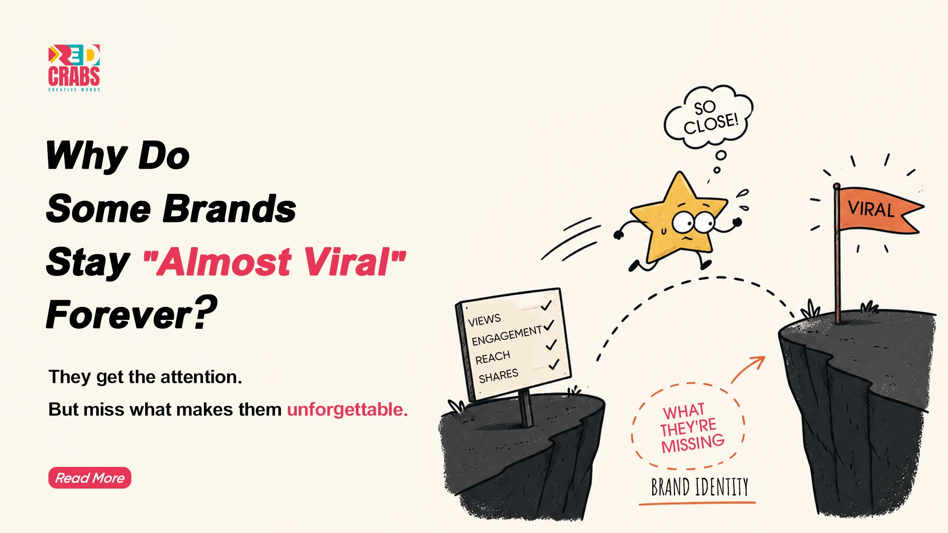
There was a time when brands knew exactly who they were competing with, because the landscape was structured and predictable. Competition meant looking at similar brands, comparing products, pricing, and positioning, and then responding accordingly. 

That clarity no longer exists in the same way. 

Today, your brand is not just competing with other brands, but with everything your audience encounters while scrolling through their feed. This includes content that was never meant to compete with you, such as memes, creators, short videos, and moments that feel more engaging simply because they are easier to consume. 

That is the real competition now, and most brands are still not looking at it that way. 

The Shift Most Brands Miss in Digital Competition Analysis 

Most brands continue to approach competition as if it still exists within clearly defined categories. They analyse what others in their space are doing and try to improve on it, assuming that better execution within the same framework will lead to better results. 

However, the audience is not experiencing your brand inside a category. They are experiencing it inside a feed. 

In that environment, your content does not arrive with context. It appears between two completely unrelated pieces of content and is judged instantly. The comparison is not logical, but instinctive. 

This is where digital competition analysis often becomes incomplete, because it focuses on identifying competitors while the audience responds to contrast. 

People are not asking whether your brand is better than another. They are deciding whether it is worth their attention in that moment. 

Why “Good Content” Quietly Disappears 

One of the more difficult truths in digital marketing is that good content often goes unnoticed. This does not happen because the content lacks quality, but because it does not create a strong enough reason to stay. 

Many brands invest in getting things right. Their visuals are clean, their messaging is clear, and their execution is polished. Yet, the outcome often feels underwhelming. 

What is missing is not effort, but tension. 

Content that performs well usually creates a moment of curiosity, recognition, or emotional response. Without that, even well-crafted content blends into the background. 

This becomes more critical when you consider how little time people spend on each piece of content. Attention spans have reduced significantly, which means that content is judged within seconds rather than understood in detail, as highlighted in research by (Microsoft). 

What the Feed Actually Responds To 

The feed does not reward correctness. It responds to content that feels something. 

This feeling can take different forms. It could be familiarity, where the content feels instantly recognisable. It could be contrast, where it interrupts the scroll just enough to hold attention. It could also be clarity, where the message is understood without effort. 

What matters is not how much is being said, but how quickly it is experienced. 

This is where positioning begins to operate differently. It is no longer limited to how a brand is described. It becomes about how a brand is perceived in motion. 

The Question That Changes Everything 

Most brands operate with a mindset focused on maintaining output, which leads them to ask what they should post next. While this keeps content moving, it does not necessarily improve how the brand is understood. 

A more useful question is often overlooked. 

Why should someone stop for this? 

This shift changes the nature of content itself. It moves the focus from activity to intention, and from saying more to saying something that matters. 

What Changes When This Becomes Clear 

Once brands understand that they are competing with everything in the feed, their approach begins to change. 

They become less focused on doing more and more focused on doing things in a way that feels consistent over time. Instead of constantly experimenting, they begin building patterns that audiences can recognise. 

This shift is not always visible immediately, but it is felt. 

Content starts to feel less scattered and more connected, and the brand becomes easier to understand without needing explanation. 

At RedCrabs, this shift often begins with clarity before execution, because once the direction is well defined, content naturally starts aligning instead of competing within itself. You can explore this approach further at (RedCrabs). 

Where Most Brands Lose Direction 

There is a tendency to equate activity with progress, especially in digital spaces where visibility is easy to measure. 

As a result, brands post more frequently, experiment with formats, and follow trends in the hope that something will work. 

What often happens instead is fragmentation. 

Over time, the brand starts to feel inconsistent, not because the content is poor, but because it does not point in a single direction. Each piece may work individually, but together they fail to build anything meaningful. 

In a space where attention is limited, inconsistency becomes more damaging than invisibility. 

The Role of a Digital Marketing Company Today 

In this context, the role of a digital marketing company has changed in a fundamental way. 

It is no longer limited to creating and distributing content. It now involves understanding how people experience content, how they make quick decisions, and how certain brands become easier to recognise over time. 

Consistency plays a central role in this. Research suggests that consistent brand presentation can have a measurable impact on revenue, highlighting how alignment across touchpoints shapes perception in the long run, as shown in findings by (Lucidpress). 

When viewed this way, strategy becomes less about planning what to post and more about ensuring that everything being communicated feels connected. This is often where the real difference begins to show. 

How Strategy Begins to Matter Differently 

Strategy is often misunderstood as a planning exercise, but in practice, it acts as a filter. 

It helps decide what deserves to be said and what can be left out. It ensures that communication remains aligned even as formats and platforms change. 

Without this, content becomes reactive, shaped more by trends than by intention. 

Over time, this makes it harder for audiences to form a clear memory of the brand. 

Insights around content performance continue to reinforce this, showing that consistency and clarity tend to outperform scattered efforts, especially in environments where attention is limited, as supported by data from (HubSpot). 

Final Thought 

Your brand is no longer being evaluated in isolation. 

It is being experienced in passing, in between things that are often more entertaining, more relatable, or simply easier to consume. 

In that moment, there is no time to explain. 

Only time to be understood. 

So the question becomes simple. 

When your content appears, does it feel like it belongs there, or does it quietly get replaced? 

If you are rethinking how your brand shows up in these moments, it is worth exploring approaches that focus less on output and more on clarity and alignment at RedCrabs Creative Works. 

Packaging design

Key 68

Project

  • Graphic Design
  • Label Packaging
  • Illustration

Industry

Health & Wellness

Platform

Supplement & Product

Url

https://Key68shopifynet/

redcrabs the best digital marketing agency in hyderabad provided Brand Identity & Packaging Design for KEY68

About project

Discover the Hidden World Within: Your Microbiome Matters

Trillions of microscopic allies live within you, supporting your wellness from gut health to overall vitality. This complex ecosystem influences 100+ aspects of your well-being.

Understanding and nurturing our relationship with the microbial world opens doors to enhanced health and a deeper appreciation for life’s intricate web.

Find Right Product For Right Solution

Color Palette

The predominant color will be SunflowerYellow.
It will be used as the main color and
base color in all its combinations.

Other colors that will complement
the brand identity will be 4Skus Respective Colors.

Typography

Ambient (Regular)

Ambient (Regular, Medium, & Bold)

Aa Bb Cb Dd Ee Ff Gg Hh Ii

Jj Kk Ll Mm Nn Oo Pp Qq R

Ss Tt Uu Vv Ww Xx Yy Zz

0 1 2 3 4 5 6 7 8 9

Graphic Design

MedhAnkura

Project

  • Graphic Design
  • Logo Design
  • Branding

Industry

Innovation

Platform

Research & Innovation

Branding

Research & innovation Company

Letter ‘M’

Medha (intelligence or brain)

Ankura (sapling)

004C91

F47421

THE PULSE OF INNOVATION: MEDHANUKRA’S VISION IN COLOR

At MedhAnkura, F47421 symbolizes bold energy, passion, and creativity, driving our relentless pursuit of innovative solutions.

004C91, represents the spark of discovery, illuminating new ideas and guiding MedhAnkura toward transformative solutions.

Graphic design

Ayuvu

Project

  • Graphic Design
  • Logo Design
  • Branding

Industry

Medical

Platform

Monitoring & Innovation

Brand Identity

Ayuvu Command Centre

Healthcare & Connecting Dots

Letter ‘A’

AYUVU Icon

004C91

F47421

AYUVU COMMAND CENTER

Logo Elements:

  •  Healthcare Symbol: The logo uses a bold, modern cross as its central symbol. This is a widely recognized symbol of health and medical care.
  • Square and Lines: The cross is enclosed within a square. The square can represent stability, structure, and order.

Health Care Hub

The logo could represent a central hub for a healthcare network, connecting people to health resources and medical professionals regardless of location.

Global Reach

The Dots extending outwards could signify the organization’s global reach, providing healthcare services to people around the world.

Collaboration

The cross, a symbol of medicine, intertwined with a square, which can represent technology or structure, could embody the concept of health and technology working together.

Colour Scheme

Blue: Blue is associated with trust, security, and professionalism, all of which are important for a healthcare organization.

Orange: Orange Is associated with trust, security, and professionalism, all of which are important for a healthcare organization.

Video design

Ayuvu

Command Centre

Project

  • Video Design
  • Video Editing
  • Visual Communication

Industry

Healthcare

Platform

Visual Communication & Healthcare

Video Design & Editing

Ayuvu Command Centre

Video design

RAMAYYA
Story

Project

  • Video Design
  • Video Editing
  • Visual Communication

Industry

Healthcare

Platform

Visual Communication & Healthcare

Video Design & Editing

Story Narration

ATL/BTL

Smart Rack

Project

  • Video Design
  • Video Editing
  • Visual Communication

Industry

Healthcare

Platform

Pharma &
Inventory management

Video Design & Editing

Smart Rack

ATL/BTL

MedUnited

Hospitals

Project

ATL/ BTL

Industry

Healthcare

Platform

Hospitals & Clinics

ATL/BTL

Hospitals & Clinics

ATL (Above The Line)

WhatsApp Image 2024-11-08 at 20.29.33_3d5d49e3

BTL (Below the Line)

2024 - World Heart Day “Health Walk”(Amalapuram)

Research & Validation

MedUnited
Hospitals

Project

  • Market Research
  • Market Validation
  • Secondary Research
  • Competitor Analysis
  • Business Audits
  • Cluster Research

Industry

Healthcare

Platform

Research & Validation

Research & Validation

MedUnited Hospitals

COMPANY OVERVIEW

At RedCrabs, our Research & Validation team specializes in delivering thorough market insights, competitive analysis, and data-driven strategies. We provide valuable guidance to support our clients’ expansion, market entry, and sustained growth. Our client portfolio includes prominent healthcare(MedUnited, KIMS, AyuvuBharosa), technology, insurance(Trovity) and real estate firms like Avaasa. Below is a detailed breakdown of our work for MedUnited, covering our processes in competitor analysis, market validation, primary and secondary research and market scope identification.

01.

Competitor Analysis

02.

Market Validation

03.

Primary and Secondary Research

04.

Identifying Scope of Expansion

Competitor Analysis

Our work with MedUnited included a thorough Competitor Analysis to identify key players in the healthcare market across the Amalapuram and Raipur clusters. By examining the service portfolios, pricing structures, patient satisfaction levels, and unique value propositions of competitors, we highlighted areas where MedUnited could differentiate its services. The analysis informed MedUnited about

Gaps in competitor offerings

Strengths and weaknesses of local and regional competitors

at RedCrabs we help you identify the Strengths and weaknesses of local and regional competitors

Potential strategies for attracting and retaining patients based on competitor insights

This competitor analysis equipped MedUnited with a clear view of the competitive landscape, highlighting positioning opportunities that would appeal to a diverse patient demographic.

MARKET VALIDATION
To ensure the feasibility of MedUnited’s market expansion, we conducted Market Validation focusing on both secondary and primary data sources to understand demand, healthcare accessibility, and community health needs in Amalapuram and the surrounding areas. Our validation process included:

“Analysis of the demographic and socio-economic profile of the target market.”

“Evaluation of healthcare spending patterns and patient preferences.”

“Assessment of healthcare provider density and demand for specific medical services.”

Through these insights, we confirmed the region’s demand for expanded healthcare services and identified areas where MedUnited could introduce differentiated offerings, making an impact in underserved communities.

PRIMARY AND SECONDARY RESEARCH

Our approach relied on Primary and Secondary Research methods to gather data accurately and comprehensively:

Primary Research

We conducted on-the-ground surveys with patients, doctors, and healthcare administrators across hospitals and clinics in Amalapuram, Raipur, and Palakole clusters. By engaging with local residents and healthcare providers, we obtained firsthand insights into patient satisfaction, treatment preferences, common health issues, and unmet needs. The findings allowed MedUnited to align its offerings with patient expectations and to tailor services to meet specific local needs.

Secondary Research

Supplementing our primary data, we compiled relevant industry reports, regional healthcare statistics, and previous market studies. This secondary data was crucial in establishing benchmarks and understanding healthcare trends, allowing us to cross-reference and validate findings from primary research.

Together, these research efforts built a holistic view of the healthcare landscape, identifying immediate opportunities for MedUnited’s growth while ensuring that all recommendations were data-driven and reflective of actual market conditions making us the best digital marketing agency in Hyderabad.

Identifying Scope of Expansion

With data from our competitor analysis and market research, we identified the scope for MedUnited’s expansion across Raipur, Palacole and Amalapuram clusters. Key areas we highlighted included:

Service Expansion: Based on the feasibility survey data, there was a marked need for specialized care facilities, such as Nephrology & Cardiology , which were underrepresented in the local healthcare market.

Patient-Centric Services: High demand for affordable, accessible healthcare services indicated potential for MedUnited to expand by offering services like telemedicine, home healthcare, and medicine delivery to reach underserved rural populations.

Partnership Opportunities: We identified opportunities for strategic partnerships with local clinics and healthcare providers, allowing MedUnited to increase its footprint quickly and efficiently.

Our work for MedUnited showcases how RedCrabs leverages robust research and validation processes to provide clients with the strategic insights needed to make informed decisions and enter new markets with confidence. Our commitment to data-driven strategies helps clients like MedUnited achieve impactful, sustainable growth.

UX/UI design

GFI

(GOLF FEDERATION OF INDIA)

GFI

(GOLF FEDERATION OF INDIA)

Project

  • UI/UX
  • Web Development
  • Illustration

Industry

Sports

Platform

Website

GFI (Golf Federation of India)

About project

 The redesign of the Golf Federation of India (GFI) website focuses on modernizing its digital presence with a clean, responsive, and user-friendly interface. The new site enhances navigation, making it easier to access tournament schedules, rankings, and membership details. A key feature is the integration of a tournament management system for live scores and registrations, along with a dedicated member portal for personalized services.

The redesign also supports GFI’s mission to promote golf across India, highlighting initiatives like “Gaon se Golf Tak” and grassroots programs. With a fresh visual appeal, media-rich content, and social media integration, the website will serve as a central hub for players, fans, and the golfing community.

Design System

Primary Colors

Shadows styles

Ui Designs

UX/UI design

ZENLIVES/ ZENTEENS

Project

  • UI/UX
  • App Development
  • Illustration

Industry

Mental Health

Platform

Mobile Application

APPS

ZENLIVES/ ZEN TEENS

About project

ZenLives and ZenTeens are mental health apps designed to help adults and teens manage their well-being through personalized guidance. By answering mental health questions, users receive tailored strategies for managing stress, anxiety, and depression. ZenLives offers support for adults facing work or life challenges, while ZenTeens caters to teens dealing with school pressure and emotional growth. Both apps feature a calming, user-friendly interface and incorporate mindfulness practices like meditation and breathing exercises, empowering users to take control of their mental health.

Design System

Design System uses soothing colors and simple layouts, with ZenLives mature and ZenTeens vibrant, ensuring easy, accessible use.

UI screens

Fill the Form