Why Some Pages Feel Like People and Others Like Brochures

Recent Posts

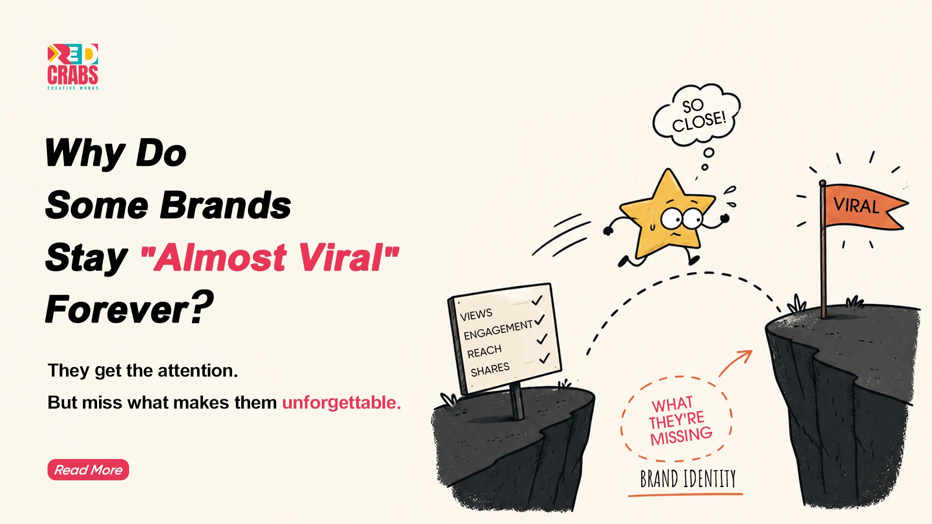
There is a specific kind of silence that happens in boardrooms when a brand realization hits the table. It usually follows a presentation filled with high-res mockups and “optimized” captions that everyone agreed were safe, professional, and on-brand. But then, someone asks the uncomfortable question: “Does this actually sound like us, or does it just sound like everyone else?” 

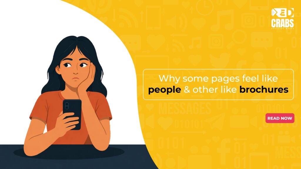
Most of the internet has become a digital waiting room. It’s filled with brands that look like high-end brochures polished, beautiful, and completely hollow. We’ve built an era of marketing that is terrified of a fingerprint, and in doing so, we’ve accidentally squeezed the life out of our connection with the audience. 

Moving from a static corporate presence to a living brand isn’t about a budget; it’s about a brand voice strategy that values the messy truth over the sanitized script.

The Ghost in the Machine 

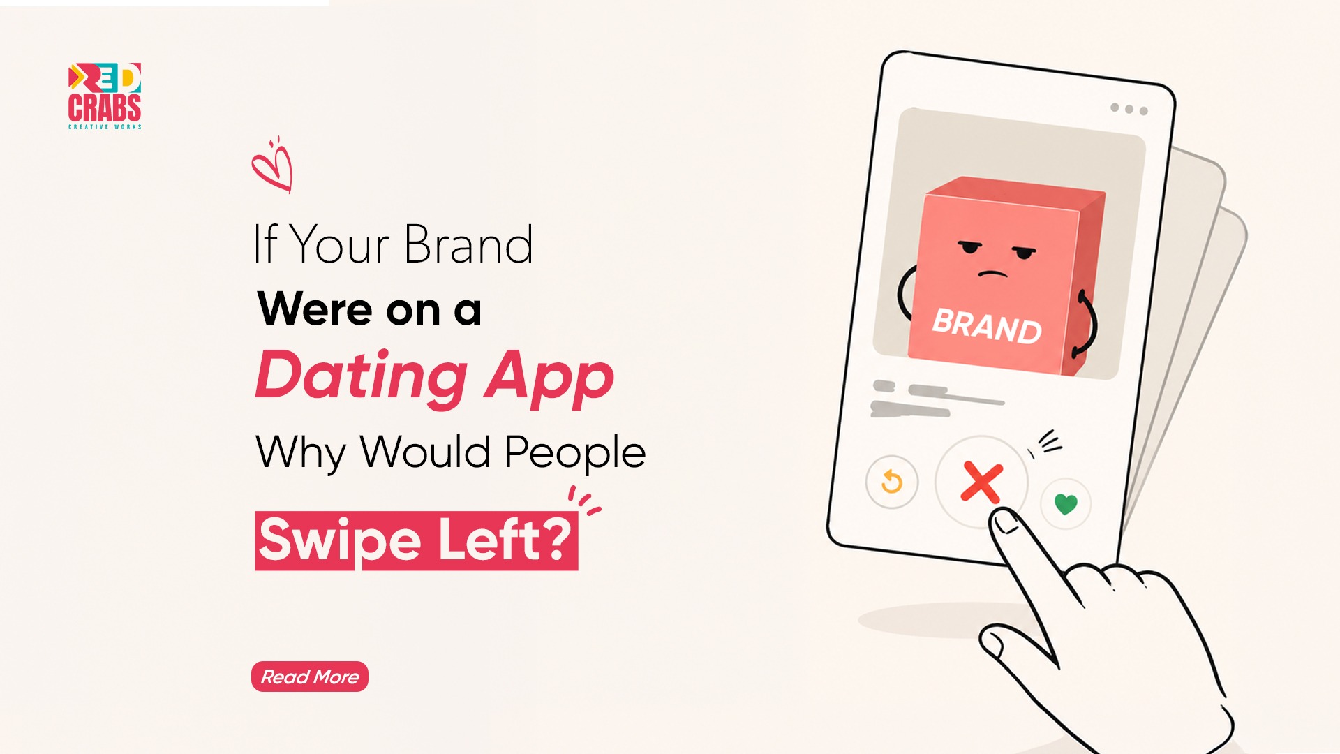
We’ve all experienced it. You click on a brand’s Instagram or blog and suddenly you’re in a space where the air feels thin. The captions are perfect. The photos are flawless. But there is no soul. It feels like it was written by a committee that is terrified of making a human mistake. 

This is the trap of the modern business. We believe that being “professional” means being invisible. But the irony of 2026 is that in a world flooded with AI-generated perfection, people are actually starving for the unpolished reality of humanized marketing. 

At Red Crabs, we often see that the moments that truly stop the scroll aren’t the big, expensive campaigns. It’s the late-night “behind the scenes” session where the team is debating a design choice over cold coffee, or the honest post about a project that didn’t go as planned. Humans don’t connect with perfection; they connect with the “cracks” in the facade. Authenticity is the only currency that an algorithm can’t fake [Dash]. When you show the struggle, you give people something to hold onto. 

The Art of the “Long Game” Lore 

Think about the brands people actually love to follow. You don’t just know their products; you know their “Lore.” You know their recurring jokes, their specific stance on industry clichés, and the personality of the people behind the screen. 

A brochure treats every post like a cold start a fresh sales pitch to a room full of strangers. But a human brand treats every post like the next chapter in a long, rambling conversation. This is the heartbeat of a real social media engagement strategy. 

When a brand remembers a joke from three months ago or celebrates a specific follower’s small win, they stop being a business and start being a character in the user’s life. If that character feels missing from your page, looking into the Best Digital Marketing Services isn’t about buying more ads; it’s about rediscovering the story you’re trying to tell.

Can You Pass the Turing Test? 

The irony of our current age is that AI can now write “polite” and “helpful” copy better than most humans. It’s efficient and fast, but it lacks a “Now.” It doesn’t know how the energy feels in your office today or why the team is collectively excited about a niche breakthrough. 

To break out of “Brochure Mode,” a brand has to lean into the things a machine can’t do: 

The Risk of Perspective: AI is programmed to be safe. Humans are allowed to have an opinion. A real brand voice strategy requires having a “hot take” a perspective that might actually make someone stop and think. 

Spontaneity: A brochure is pre-planned six months in advance. A human brand reacts to the world in real-time the weather, the news, or a funny comment within the hour. 

The Specificity of Failure: A robot cannot feel embarrassed. When a brand admits a real mistake without a PR-sanitized script, it creates a bond that no algorithm can touch [Statistics]. 

The Verdict of the Heart 

At the end of the day, marketing isn’t about moving numbers; it’s about moving people. And people move toward warmth. 

  • Trust is Subconscious: We don’t buy what people do; we buy why they do it. We trust the neighbor we know, not the billboard we see [Trust]. 
  • Emotional ROI: When a customer feels like they “know” the team behind the logo, they become significantly more valuable over their lifetime because they aren’t just customers they’re fans [Emotions]. 
  • The Signal in the Noise: In a world of AI-generated static, the human voice is the only thing that actually cuts through the fog. 

More Than a Document 

A brand shouldn’t feel like a polished piece of glass. It should feel like a conversation over a cup of coffee a little bit scattered, definitely specific, and entirely unique. It should be shaped by a specific team, a local culture, and those beautiful, human failures that happen behind the scenes. 

At Red Crabs, we’ve realized that the best work doesn’t come from a template. It comes from finding the heartbeat of a business and turning the volume up until everyone can hear it. Don’t be afraid to be a little less “perfect” and a lot more “you.” 

Stop being a brochure. Start being the person people actually want to talk to Red Crabs is here to help you find that voice. 

Packaging design

Key 68

Project

  • Graphic Design
  • Label Packaging
  • Illustration

Industry

Health & Wellness

Platform

Supplement & Product

Url

https://Key68shopifynet/

redcrabs the best digital marketing agency in hyderabad provided Brand Identity & Packaging Design for KEY68

About project

Discover the Hidden World Within: Your Microbiome Matters

Trillions of microscopic allies live within you, supporting your wellness from gut health to overall vitality. This complex ecosystem influences 100+ aspects of your well-being.

Understanding and nurturing our relationship with the microbial world opens doors to enhanced health and a deeper appreciation for life’s intricate web.

Find Right Product For Right Solution

Color Palette

The predominant color will be SunflowerYellow.
It will be used as the main color and
base color in all its combinations.

Other colors that will complement
the brand identity will be 4Skus Respective Colors.

Typography

Ambient (Regular)

Ambient (Regular, Medium, & Bold)

Aa Bb Cb Dd Ee Ff Gg Hh Ii

Jj Kk Ll Mm Nn Oo Pp Qq R

Ss Tt Uu Vv Ww Xx Yy Zz

0 1 2 3 4 5 6 7 8 9

Graphic Design

MedhAnkura

Project

  • Graphic Design
  • Logo Design
  • Branding

Industry

Innovation

Platform

Research & Innovation

Branding

Research & innovation Company

Letter ‘M’

Medha (intelligence or brain)

Ankura (sapling)

004C91

F47421

THE PULSE OF INNOVATION: MEDHANUKRA’S VISION IN COLOR

At MedhAnkura, F47421 symbolizes bold energy, passion, and creativity, driving our relentless pursuit of innovative solutions.

004C91, represents the spark of discovery, illuminating new ideas and guiding MedhAnkura toward transformative solutions.

Graphic design

Ayuvu

Project

  • Graphic Design
  • Logo Design
  • Branding

Industry

Medical

Platform

Monitoring & Innovation

Brand Identity

Ayuvu Command Centre

Healthcare & Connecting Dots

Letter ‘A’

AYUVU Icon

004C91

F47421

AYUVU COMMAND CENTER

Logo Elements:

  •  Healthcare Symbol: The logo uses a bold, modern cross as its central symbol. This is a widely recognized symbol of health and medical care.
  • Square and Lines: The cross is enclosed within a square. The square can represent stability, structure, and order.

Health Care Hub

The logo could represent a central hub for a healthcare network, connecting people to health resources and medical professionals regardless of location.

Global Reach

The Dots extending outwards could signify the organization’s global reach, providing healthcare services to people around the world.

Collaboration

The cross, a symbol of medicine, intertwined with a square, which can represent technology or structure, could embody the concept of health and technology working together.

Colour Scheme

Blue: Blue is associated with trust, security, and professionalism, all of which are important for a healthcare organization.

Orange: Orange Is associated with trust, security, and professionalism, all of which are important for a healthcare organization.

Video design

Ayuvu

Command Centre

Project

  • Video Design
  • Video Editing
  • Visual Communication

Industry

Healthcare

Platform

Visual Communication & Healthcare

Video Design & Editing

Ayuvu Command Centre

Video design

RAMAYYA
Story

Project

  • Video Design
  • Video Editing
  • Visual Communication

Industry

Healthcare

Platform

Visual Communication & Healthcare

Video Design & Editing

Story Narration

ATL/BTL

Smart Rack

Project

  • Video Design
  • Video Editing
  • Visual Communication

Industry

Healthcare

Platform

Pharma &
Inventory management

Video Design & Editing

Smart Rack

ATL/BTL

MedUnited

Hospitals

Project

ATL/ BTL

Industry

Healthcare

Platform

Hospitals & Clinics

ATL/BTL

Hospitals & Clinics

ATL (Above The Line)

WhatsApp Image 2024-11-08 at 20.29.33_3d5d49e3

BTL (Below the Line)

2024 - World Heart Day “Health Walk”(Amalapuram)

Research & Validation

MedUnited
Hospitals

Project

  • Market Research
  • Market Validation
  • Secondary Research
  • Competitor Analysis
  • Business Audits
  • Cluster Research

Industry

Healthcare

Platform

Research & Validation

Research & Validation

MedUnited Hospitals

COMPANY OVERVIEW

At RedCrabs, our Research & Validation team specializes in delivering thorough market insights, competitive analysis, and data-driven strategies. We provide valuable guidance to support our clients’ expansion, market entry, and sustained growth. Our client portfolio includes prominent healthcare(MedUnited, KIMS, AyuvuBharosa), technology, insurance(Trovity) and real estate firms like Avaasa. Below is a detailed breakdown of our work for MedUnited, covering our processes in competitor analysis, market validation, primary and secondary research and market scope identification.

01.

Competitor Analysis

02.

Market Validation

03.

Primary and Secondary Research

04.

Identifying Scope of Expansion

Competitor Analysis

Our work with MedUnited included a thorough Competitor Analysis to identify key players in the healthcare market across the Amalapuram and Raipur clusters. By examining the service portfolios, pricing structures, patient satisfaction levels, and unique value propositions of competitors, we highlighted areas where MedUnited could differentiate its services. The analysis informed MedUnited about

Gaps in competitor offerings

Strengths and weaknesses of local and regional competitors

at RedCrabs we help you identify the Strengths and weaknesses of local and regional competitors

Potential strategies for attracting and retaining patients based on competitor insights

This competitor analysis equipped MedUnited with a clear view of the competitive landscape, highlighting positioning opportunities that would appeal to a diverse patient demographic.

MARKET VALIDATION
To ensure the feasibility of MedUnited’s market expansion, we conducted Market Validation focusing on both secondary and primary data sources to understand demand, healthcare accessibility, and community health needs in Amalapuram and the surrounding areas. Our validation process included:

“Analysis of the demographic and socio-economic profile of the target market.”

“Evaluation of healthcare spending patterns and patient preferences.”

“Assessment of healthcare provider density and demand for specific medical services.”

Through these insights, we confirmed the region’s demand for expanded healthcare services and identified areas where MedUnited could introduce differentiated offerings, making an impact in underserved communities.

PRIMARY AND SECONDARY RESEARCH

Our approach relied on Primary and Secondary Research methods to gather data accurately and comprehensively:

Primary Research

We conducted on-the-ground surveys with patients, doctors, and healthcare administrators across hospitals and clinics in Amalapuram, Raipur, and Palakole clusters. By engaging with local residents and healthcare providers, we obtained firsthand insights into patient satisfaction, treatment preferences, common health issues, and unmet needs. The findings allowed MedUnited to align its offerings with patient expectations and to tailor services to meet specific local needs.

Secondary Research

Supplementing our primary data, we compiled relevant industry reports, regional healthcare statistics, and previous market studies. This secondary data was crucial in establishing benchmarks and understanding healthcare trends, allowing us to cross-reference and validate findings from primary research.

Together, these research efforts built a holistic view of the healthcare landscape, identifying immediate opportunities for MedUnited’s growth while ensuring that all recommendations were data-driven and reflective of actual market conditions making us the best digital marketing agency in Hyderabad.

Identifying Scope of Expansion

With data from our competitor analysis and market research, we identified the scope for MedUnited’s expansion across Raipur, Palacole and Amalapuram clusters. Key areas we highlighted included:

Service Expansion: Based on the feasibility survey data, there was a marked need for specialized care facilities, such as Nephrology & Cardiology , which were underrepresented in the local healthcare market.

Patient-Centric Services: High demand for affordable, accessible healthcare services indicated potential for MedUnited to expand by offering services like telemedicine, home healthcare, and medicine delivery to reach underserved rural populations.

Partnership Opportunities: We identified opportunities for strategic partnerships with local clinics and healthcare providers, allowing MedUnited to increase its footprint quickly and efficiently.

Our work for MedUnited showcases how RedCrabs leverages robust research and validation processes to provide clients with the strategic insights needed to make informed decisions and enter new markets with confidence. Our commitment to data-driven strategies helps clients like MedUnited achieve impactful, sustainable growth.

UX/UI design

GFI

(GOLF FEDERATION OF INDIA)

GFI

(GOLF FEDERATION OF INDIA)

Project

  • UI/UX
  • Web Development
  • Illustration

Industry

Sports

Platform

Website

GFI (Golf Federation of India)

About project

 The redesign of the Golf Federation of India (GFI) website focuses on modernizing its digital presence with a clean, responsive, and user-friendly interface. The new site enhances navigation, making it easier to access tournament schedules, rankings, and membership details. A key feature is the integration of a tournament management system for live scores and registrations, along with a dedicated member portal for personalized services.

The redesign also supports GFI’s mission to promote golf across India, highlighting initiatives like “Gaon se Golf Tak” and grassroots programs. With a fresh visual appeal, media-rich content, and social media integration, the website will serve as a central hub for players, fans, and the golfing community.

Design System

Primary Colors

Shadows styles

Ui Designs

UX/UI design

ZENLIVES/ ZENTEENS

Project

  • UI/UX
  • App Development
  • Illustration

Industry

Mental Health

Platform

Mobile Application

APPS

ZENLIVES/ ZEN TEENS

About project

ZenLives and ZenTeens are mental health apps designed to help adults and teens manage their well-being through personalized guidance. By answering mental health questions, users receive tailored strategies for managing stress, anxiety, and depression. ZenLives offers support for adults facing work or life challenges, while ZenTeens caters to teens dealing with school pressure and emotional growth. Both apps feature a calming, user-friendly interface and incorporate mindfulness practices like meditation and breathing exercises, empowering users to take control of their mental health.

Design System

Design System uses soothing colors and simple layouts, with ZenLives mature and ZenTeens vibrant, ensuring easy, accessible use.

UI screens

Fill the Form